04-05.11.2021
04.11.2021
Feeling much better and finished up the Storage Hall today. While the text is there and formatted, I’m going to have to return and decide if I want the thing to be 2 pages or 4…. Bit of a decision there, I want to leave room for illustrations to break up the text.

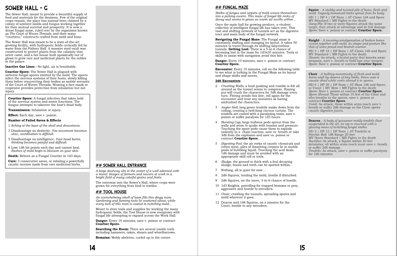
Dungeon design and conveyance – Attached is an example of one of the layouts I’ve been working on so far, with placeholder areas for the map and some possible art. While it looks quite spartan now, I want to do a bit of a breakdown on how I’ve generally typed up the rooms and areas of the dungeon to allow for easily running the adventure and not bogging down the Referee; I myself prefer as little prep as possible when refereeing and I want this massive dungeon to be easy enough to play within 5 minutes of picking it up.

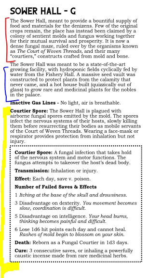
Breakdown of Area – The “Area” represents a collection of connected and thematically similar rooms. I give a preface and run-down of the area (red) to set the tone and give the referee an overview of what to expect and how to prepare the players. After that there is a brief historical overview (blue), describing the original function of the area and notable bits of information that may be interesting, but not necessarily pertinent to running the game. Finally, there are the quirks and dangers (yellow), special effects present in this area that the players will have to contend with or be able to exploit. These are the first things the referee will see and are therefore written to be clear, concise, and easy to reference.

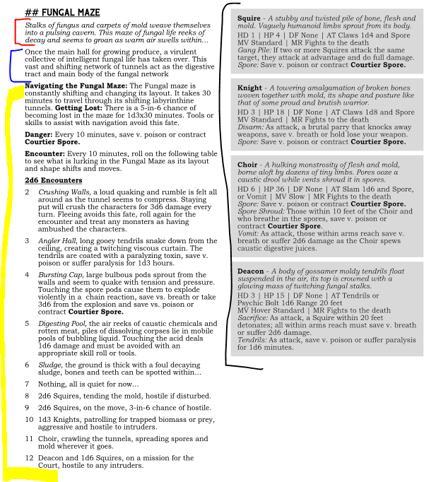
Breakdown of Room – The room starts with a “what the characters see, hear, smell” description (red), where only the most prevalent and pressing information about the room is given. The next paragraph is additional information on the room (blue) that may not be apparent until players explore it or begin asking questions. After the descriptions and overview of the room comes the mechanics or interactive aspects (yellow), each separated with their own description for easy reference. I try to keep all of the information as concise as possible as well as break it down into manageable chunks with labels that can be skimmed over quickly, that way the ref can check the room, gloss over the general layout, tone, and dangers, and then read the actual entries when they become relevant.
Another thing I’m planning to do is include the monster entries (black) on the actual page. There is a bit of a heated debate on whether it’s better to keep the monster stats on the page they occur in, or reference them in an index later in the module. While the latter saves on layout space and keeps redundant entries out, the former makes the module easier to run on the fly and avoid page turning. For the this module, I’m opting for stats “on the page,” at the very least because it will help me run this module when I begin play-testing it.
05.11.2021
New level! Yeehaw!
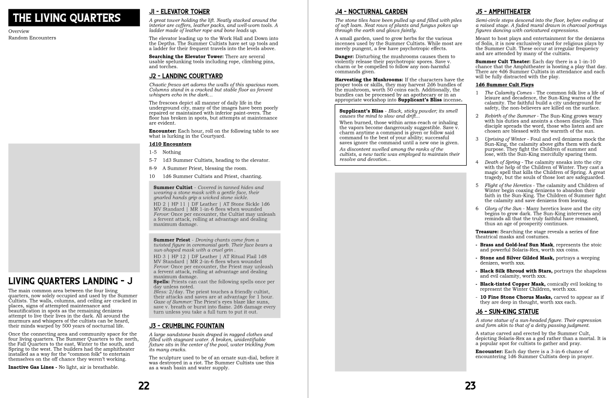
Started laying out the living quarters.
---

End of Day: Despite my nose constantly being stuffed, I did manage to finish off the Living Quarters Landing area. Only 6 rooms, but considering the mess my nasal cavities have been, I will call that a resounding success.
A small thing I’m happy about is I managed to fit in a reference to ancient Greek theater with the treasure for the Amphitheatre.
Anyway, leave a like and comment if you would be so kind. I'm gonna take a hot shower and try to shake off this cold.
Get AVE NOX
AVE NOX
A mega-dungeon of forgotten history and disaster buried deep in the dark of the earth.
| Status | In development |
| Category | Physical game |
| Author | Feral Indie Studio |
| Genre | Adventure |
| Tags | Horror, OSR, Tabletop role-playing game, zine |
More posts
- Updated file v1.1May 20, 2024
- CrowdfundingNov 08, 2023
- Preview, Release, GenCon, and My Latin is Not GoodAug 01, 2023
- 26.07.2023 Previews (finally some art)Jul 26, 2023
- 15.03.2023 - A Dungeon's Dungeon, What Really is "Difficulty" and Home-BaseMar 16, 2023
- 03-08-2023 "Hiatus? Never heard of them..."Mar 10, 2023
- 08-15.11.2021 Update, Concept Art, "Danger?"Nov 15, 2021
- 07.11.2021Nov 07, 2021
- 27.10-03.11.2021 The *Work* and the SiegeNov 04, 2021
Comments
Log in with itch.io to leave a comment.
Great insight to your creative process and methods. This is a massive undertaking and I'm really impressed with your hard work. It really is like a siege, isn't it?
Also thanks for the room descriptions! The fungal maze sounds like an awful place. I love it!